The Quantified Self
The assignment for my Data Visualization Class at the CUNY Graduate Center, taught by Erin Daugherty and Michelle McSweeney was to visualize a quantified self project.
The Data: Background
I chose to work with data about my work as a librarian at Barnard College, a private, predominantly women’s baccalaureate institution in New York City. As a librarian at Barnard, I have three specialties. I am the Associate Director of Communications, a Personal Librarian (“personal librarian” is how we refer to research and instruction librarians at Barnard because our service is warmly customized to our assigned students and liaison faculty), and the Zine Librarian.
Please note that the consultations, instruction, and reference categories are most evocative of the Personal Librarian role. As AD for Communications I am responsible for event programming, outreach, and social media, as well as serving on the library’s management team. As Zine Librarian the work I do cataloging zines, which I spend a full day on each week is not represented in the numbers, nor is the significant amount of professional work I do, including publishing in lay and scholarly outlets and presenting at conferences, universities, and other venues.
The Research Question
ME: I am a slacker.
ALSO ME: I am a driven workaholic.
Both of these things feel true. But are they? What do I do all day? All week? Month? Year?
Every month I complete a report at work, detailing the number of references questions I’ve handled, consultations, I’ve given, classes I’ve taught, researchers I’ve hosted, and more. In these monthly reports I indicate which of my three work hats I was wearing during each action: communications, personal librarian, or zine librarian. It would be useful for me to know how much effort I am put into each part of my job as my library prepares to expand its resources and services in the new school year. What am I doing? How am I spending my time? Which hat gets the most wear?
Furthermore, as I dig into the data, I am finding that doing so is providing an unexpected benefit: pleasure. Reminding myself of the research topics I get to consult on, the classes I get to teach in, and the zine projects I get to engage in makes me feel intensely happy about the students, faculty, zinesters, and librarians I work with.
The Audience
In a quantified self project, I assume the audience is typically the self. In this case I think there is practical use in sharing my visualizations with my boss as she imagines how we may need to adapt my responsibilities when my library opens in its new space this fall, when she conducts my annual review, and generally when she communicates about library work to college administrators.
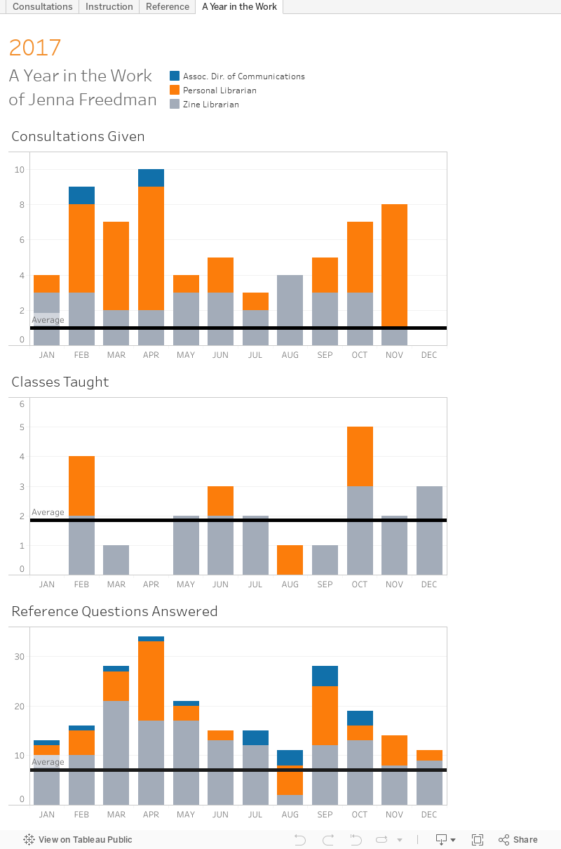
Visualization Description
Below we see three paned bar charts:
- Consultations Given
- Classes Taught
- Reference Questions Answered
A 1-3 colored bar represents each month of the year 2017, and the colors correspond to role: communications, personal librarian, and zine librarian. Each chart is crossed with an average line, to help the reader see which months are busier and less busy than usual.
The Data: Visualized
If the embed link isn’t functioning in your browser, here’s a link to the visualization on Tableau Public.
Data Decisions
- Colors were chosen for a color blind compliance, rather than for general aesthetics.
- This visualization shows the number of research consultations I gave, instruction sessions I led, and reference questions I responded to in the year 2017. I have data from December 2015-April 2018 that I am happy to share, but showing just the most recent year for which I have complete data seemed like it would give a good enough picture of how I divide my time, at least in those three areas, in a cleaner manner than including the other months.
- I originally envisioned this data in a line graph, rather than a bar chart. I switched when I realized that lines indicate trends, and while my work is cyclical one month’s numbers don’t necessarily relate to those of the previous or next month’s.
- There were many fields in my initial dataset that I chose not to include in the visualization because they were extraneous or inconsistently reported. That includes, e.g., the medium of reference questions–if they came in via email, Tweet, IM, or in person. The granularity would have muddied, rather than improved the visualization.
- I would have liked and would like to before too long, add in some of the columns in my dataset that I didn’t include, but for now, the granularity of the columns I did include feel like scope creep.
Next Steps
Once I complete my monthly report for May (soon!) I could make calendars for academic years 2016/17 and 2017/18, which would be more applicable in the higher ed setting. Still, I consider this visualization dangerous in isolation for the reasons I mentioned in the background section above. Without representing all of the other work I do in communications and zine librarianship, the loads may appear more balanced than they actually are.
I do include additional information about my communications and zine work in my monthly reports, but it is harder to compare across departments. How many events hosted or tweets tweeted equal how many zines cataloged or presentations given? That’s not to say that there isn’t Womens, Gender, and Sexuality Studies librarian (personal librarian) work that isn’t represented on the simple charts, too, e.g., outreach to students and building research guides.
Finally, I’m not sure if I answered the “am I a slacker or a driven workaholic” question with this one series of visualization. I would need to normalize it somehow. I don’t think comparing my work to that of colleagues would be useful because no one has the same balance of jobs that I do, I have fewer PL departments than others, etc. I could try mathing it to a 35-hour work-week and account for holidays, vacation (27 use-em-or-lose-em days), professional leave, and affordances for MALS coursework. And, of course, figure out how to quantify or otherwise evaluate the data not included.
I will adapt my monthly reports to this format, though, going forward!
Further Reading
For more about my process and choices, see my proposal and notes. You’ll find there information on how I reformattted and cleaned my data, fields included in the dataset but not the visualization, inconsistent reporting, database crashes, and a brief ode to the sketch, along with my initial sketch itself.
I didn’t do as much tweeting this week, but do check out my thread for a panda gif trolling Tableau, my cat’s commentary, and a hint of desperation.