Following is my blog post about what actually happened with this assignment. You can check out my original proposal and detailed documentation of my process in this shared document.
My research question started out being about school complaints in Brooklyn, compared by Community Board. Classmates, I got frustrated and gave up. I decided just to look at complaints coming from my two-block street in Brooklyn, using the 2015 data.
My audience is me! Now I know better what bothers my neighbors, so they, too, will benefit from my knowledge. Noise! They hate noise!
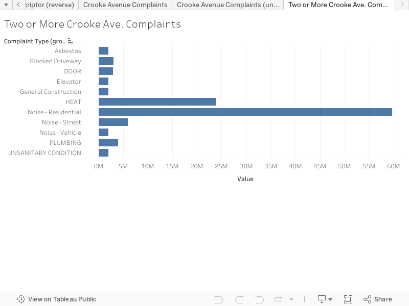
This visualization shows the top ten complaints on my street. I couldn’t get it to sort by number of complaints, but I did manage to limit the set to complaints on my street and group “Crooke Avenue” and “Crooke Ave” complaints.
All of the details are in my shared doc and on Twitter.
The next steps would be sorting the complaints by volume and adding in the other years of data.